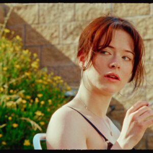
Dylan John – Filmic Luts V1 and V2
Filmic V1
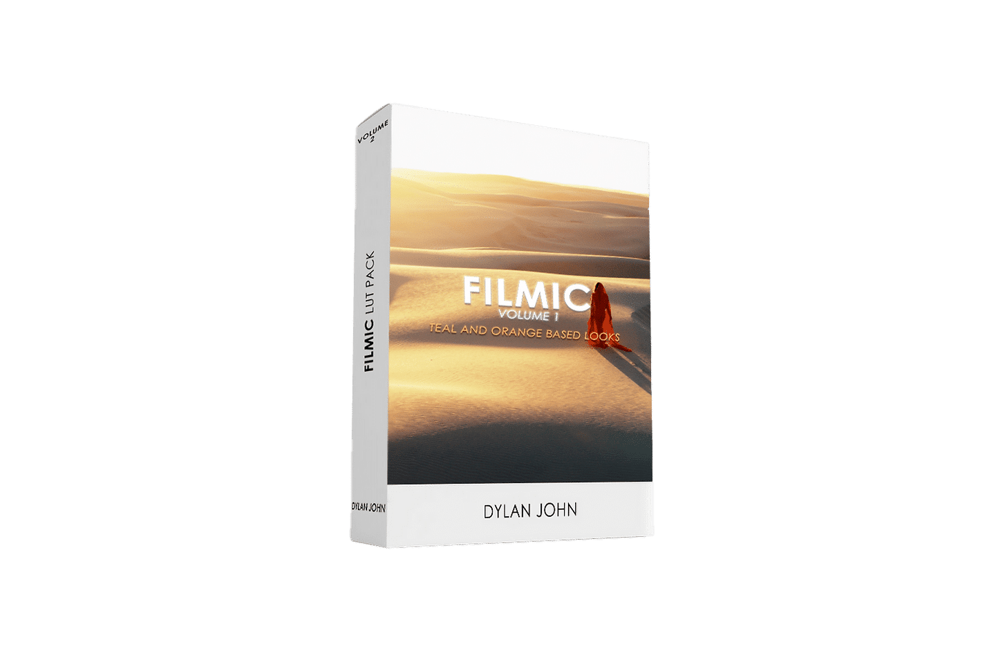
5 STANDARD PROFILE LUTS
5 LOG PROFILE LUTS
In Filmic Volume 1, I’ve focused on creating 5 quality looks for both standard and log profiles based on the most popular complementary color scheme, teal and orange. These 10 LUTs will give your footage a beautiful grade with ease.
DENVER
Denver is the most neutral LUT in the pack and is a great choice for giving your shot a more natural but stylized look. It’s a high contrast look that keeps your greens relatively green with teal and green subtly present in the shadows.
RENO
Reno is one of my favorites in the volume 1 pack. I created the look to have more contrast with faded blacks, desaturated greens that slightly swing towards yellow and a peachy hue of orange. It’s a subtle teal and orange look with a lot of character.
BOULDER
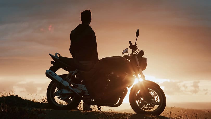
Boulder creates a vibrant teal and orange look with brighter and more saturated oranges. The look also keeps control over the different shades of blue in your shot so your blue hues stay color accurate. This look is fantastic for your sunrise and sunset footage.
CORONADO
Coronado adds some mood with increased contrast and muted oranges while accentuating the blue/teal in your shot. This look is great if you have a lot of orange or red in your shot because it will keep these hues at a more neutral tone while helping your blues to become more of a focus.
VEGAS
Vegas is full on teal and orange. No holding back on this one. This look achieves a complimentary color scheme the most and is a similar color grade to what filmmaker Sam Kolder uses.
Filmic v2
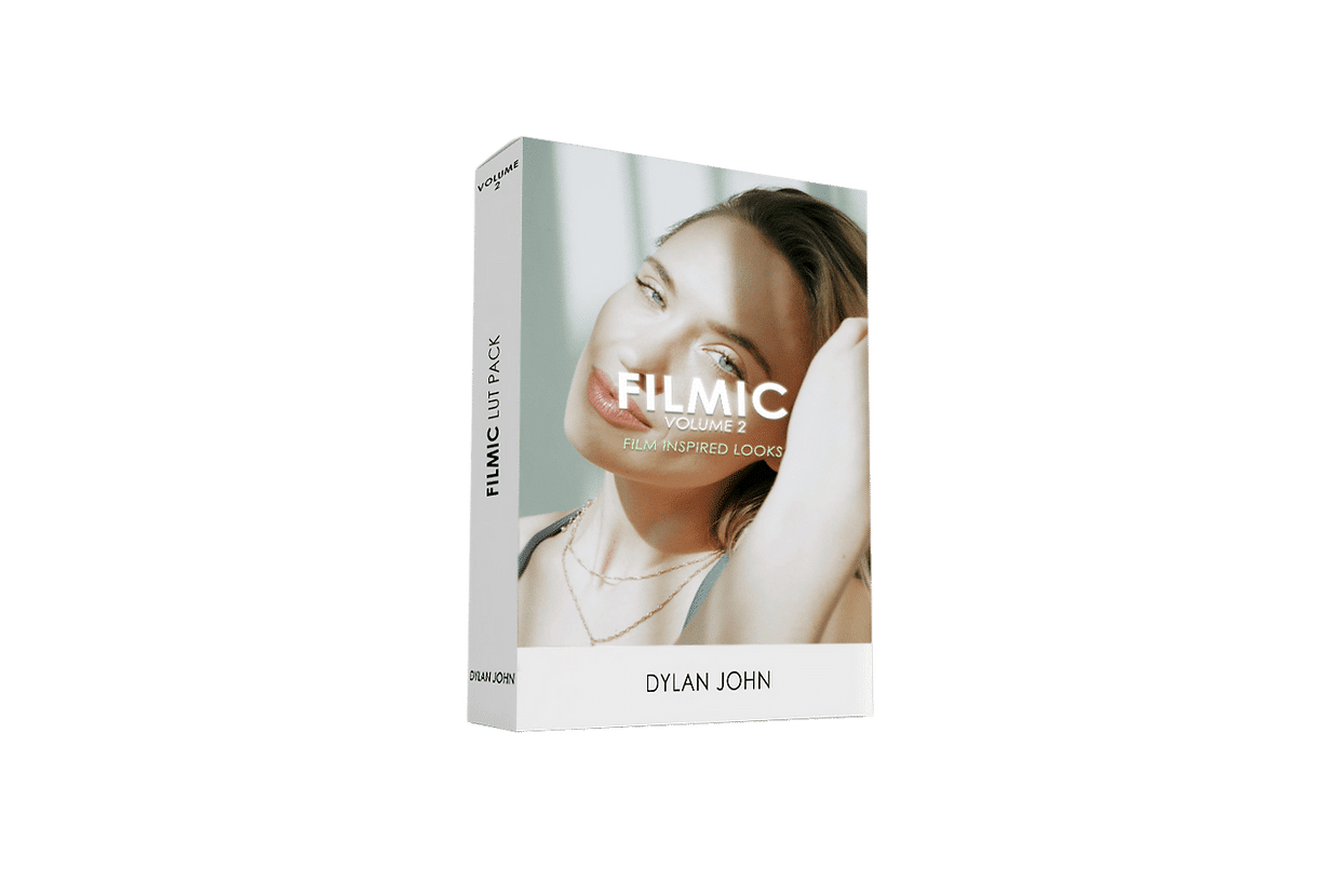
5 STANDARD PROFILE LUTS
5 LOG PROFILE LUTS
Filmic Volume 2 has 10 LUTs designed to quickly give you unique and rich, film-inspired looks. Not only will these looks quickly help your films look great, but you may find yourself using these for commercial work as well.
MAI
Is it hot in here or is it just Mai? Mai is an ‘earthy’ look with warm tones in shadows, decent contrast with slightly lifted blacks, and a solid choice for golden hour.
JACO
If saturation and vibrant yellows and blues are what you desire, then Jaco should be your go-to. This look will increase the vibrancy of colors in your shot and push a little warmth into them without adding too much contrast.
PAPUA
Shhh, this is my favorite look in the Volume 2 pack. Don’t tell. Dark greens, vibrant oranges, and an overall rich look to help your shots stand out from the crowd. This look is a similar style to one I’ve used in my travel films.
SAIGON
Saigon packs a cinematic punch with high contrast, darker greens and blues, and lively yellows for a nice film look.
DALAT
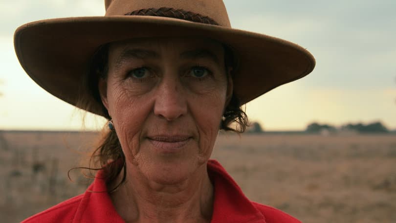
This look does a great job of keeping your talent’s skin tones looking great while adding a bit of blue and green in your shadows to create some color separation. This is a very neutral cool look and can easily make your commercial work look phenomenal.
FROM: Dylan John
